Contrast is important in artworks because it can create interest and visual tension by adding a sense of depth, balance, or drama to an image. Contrast can also be used to highlight specific areas or subjects in an image and give the work a more dynamic and appealing visual effect. A lack of contrast can also be interesting if it is consciously controlled by the artist. The article concludes with exercises.
What Does Contrast Mean?
Contrast refers to the difference or opposition between two or more elements in a work of art. These elements may include differences in color, shape, size, texture, or other visual or perceptual features.
The concept of contrast can be difficult to understand, so here are some synonyms:
- Difference
- Opposition
- Counterpart
- Deviation
- Dissonance
- Collision
- Divergence
An appropriate antonym for “contrast” could be “similarity” or “uniformity.” These words describe a lack of difference or variation between two or more elements, whereas “contrast” describes the difference between them.
Create Balance, Dynamism and Drama with Contrast
Contrasts are an important part of any artwork because they can add tension and dynamism, create a sense of depth and dimension in the image, and help define and highlight specific elements in the work.
Contrasts can also help create a sense of balance and harmony in an image when used in a balanced and deliberate way. By using contrasts, one can create a visually interesting and varied artwork that attracts the viewer’s attention and encourages them to explore the work further.
In addition, contrasts can help communicate a particular mood or emotion in the work. For example, a strong contrast between light and shadow can create a sense of drama or mystery, while a low contrast between colors can produce a more subdued and calm mood.
Examples of Artistic Contrast
The Starry Night by Vincent van Gogh
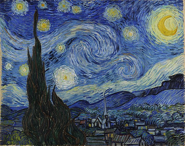
The Starry Night by Vincent van Gogh uses light–dark contrast and the balance of warm and cool colors. Composition VIII by Wassily Kandinsky contrasts lines, shapes, and colors to create movement and tension. Black Square by Kazimir Malevich explores subtle tonal contrasts within black. The Great Wave off Kanagawa by Katsushika Hokusai contrasts the enormous wave with the small boats and mountains to create drama and motion. The Persistence of Memory by Salvador Dalí contrasts surreal elements to evoke time, decay, and dreamlike stillness.
Composition VIII by Wassily Kandinsky
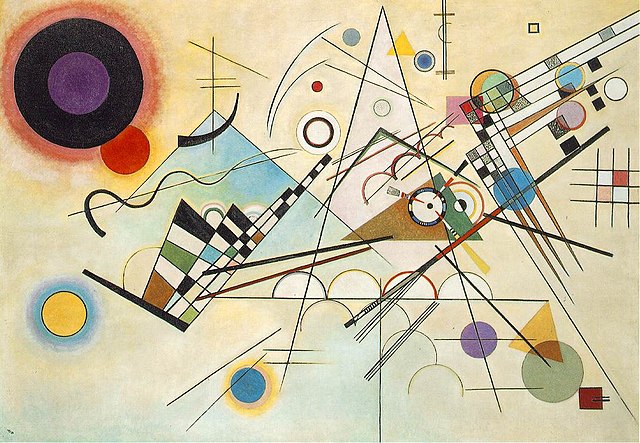
In this abstract painting, Wassily Vasilyevich Kandinsky uses a range of contrasts between lines, shapes, and colors to create a feeling of movement and tension. Kandinsky also uses contrasting colors to create a sense of depth and space in the image.
Black Square – Monochrome Painting by Kazimir Malevich
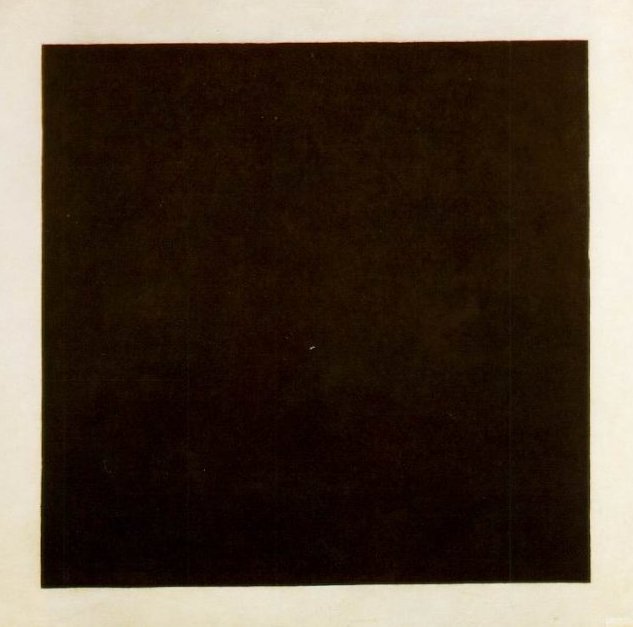
This abstract painting uses the contrast between different shades of black to create a sense of depth and movement. Malevich also uses contrasting shapes and lines to create a feeling of tension and energy in the image.
The Great Wave off Kanagawa by Katsushika Hokusai

The famous Japanese woodcut from 1831 uses the contrast between the large wave and the small boats and mountains in the background to create a sense of movement and drama. Hokusai also uses contrasting colors and textures to create a sense of depth and atmosphere in the image.
The Persistence of Memory by Salvador Dalí
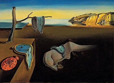
Dalí’s surrealist painting uses contrasting elements such as clocks and ants to create a feeling of time and decay. Dalí also uses contrasting colors and textures to produce a dreamlike atmosphere in the work.
Types of Contrasts
Color Contrast
This is one of the best-known types of contrast in artworks. Colors can have different emotional and symbolic meanings and can be used to create a visual effect. Color contrast can be created by combining two or more colors that stand in contrast to each other, such as complementary colors (like red and green), warm and cool colors, or various pastel and strong colors.
Light–Dark Contrast
Light–dark contrast is a type of contrast that refers to the difference between lighter and darker areas in an image. This can be achieved by using shadows and highlights or by manipulating the light source. By placing light and dark areas side by side, artists can create visual contrast that makes it easier for the viewer to distinguish between different parts of the image.
Light–dark contrast can be used to create depth and spatial perception in an image. For example, a landscape with dark shadows in the foreground and lighter areas in the background can give a sense of depth and distance. Light–dark contrast can also be used to highlight important elements in an image. By emphasizing an element with light and surrounding it with darker tones, the artist can make it more noticeable and draw the viewer’s attention.
Light–dark contrast is one of the most fundamental forms of contrast in art and can be used across many different media, including painting, drawing, and photography.
Warm–Cool Contrast
Warm–cool contrast is a type of contrast that refers to the difference between colors perceived as warm or cool. By placing warm and cool colors next to each other in an image, artists can create visual contrast that makes it easier for the viewer to distinguish between different areas of the image.
Warm–cool contrast can be used to create a sense of balance and harmony in an image. For example, a warm color like red can be used to draw the viewer’s attention to an important element in the picture, while cool colors such as blue and green can be used in the background to create a sense of calm and depth. Warm–cool contrast can also be used to create a sense of movement. For instance, a cool color can convey distance or detachment, while a warm color can evoke a feeling of motion or warmth.
Shape Contrast
Shape contrast refers to the difference between forms in a work of art. This can occur in various ways, such as through form, size, texture, or line. By placing different shapes next to each other in an image, artists can create visual contrast that makes it easier for the viewer to distinguish between different parts of the image.
Shape contrast can be used to create tension and interest in an image. By juxtaposing two or more different forms, the artist can create a visual dialogue between them. For example, an angular geometric shape can contrast with a more organic form, creating a sense of movement or dynamism.
Shape contrast can also be used to create balance and harmony. For example, a large shape on one side of the image can be counterbalanced by a smaller but more detailed form on the other side, creating visual equilibrium.
Shape contrast can be applied in different artistic media, including painting, drawing, sculpture, and photography. For instance, a sculpture with smooth, sharp lines may contrast with one featuring softer, curved lines, creating a visual interplay between the two. Shape contrasts are also used in architecture, where buildings of different forms can create visual interest and enrich an urban space.
Quantity Contrast
Quantity contrast refers to the difference in number or amount of elements in an image. This can include differences in size, density, or repetition. Quantity contrast can be used to create visual interest and balance by adjusting the number of elements in different areas. For example, an image with a large cluster of small elements on one side can contrast with a single large element on the other, producing a sense of harmony. Quantity contrast can also emphasize key elements or create a sense of movement.
Quantity contrast is essentially the opposition between much and little, large and small.
Texture Contrast
Texture contrast refers to the difference between surface textures in a work of art. Texture contrast can be applied across various artistic media, including painting, drawing, sculpture, and photography. For example, a painter may use a range of techniques and materials—brushstrokes, palette knives, or mixed media—to create visual texture contrast in a work. In sculpture, an artist can combine materials with different surface qualities, such as metal and concrete, to generate visual contrast between parts of the piece.
Exercises in the Conscious Use of Contrast
There are many exercises you can do to practice using contrast in your artworks. Here are some suggestions:
Practice creating balance: Work on achieving balance between contrasting elements in your artworks by arranging them in a harmonious way. For example, you can use a strong color contrast in one part of the image and then repeat the same colors in other parts of the work to create a sense of harmony and balance.
Sketch with pencil: Try sketching simple objects or landscapes using light and shadow. Aim to create a sense of depth and form by varying the brightness in your sketches. Start by drawing with a single pencil, then work with several pencils of different softness to achieve more nuanced tones.
Experiment with colors: Try setting up the color wheel and experiment with placing colors in different contrasting positions. For example, you can place complementary colors (colors positioned opposite each other on the color wheel) side by side to create a strong contrast. You can also create contrast between warm and cool colors or between light and dark colors.
Photography: Use your camera to take pictures with contrasting elements. For instance, photograph a black cat against a white background, or capture a building where shadows and sunlight create strong contrast. Try also combining different structures and textures. Then use the photos as inspiration to create your own artworks.
Mix media: Try combining different media in your artworks to achieve contrast between textures and surfaces. For example, you can draw over a watercolor or use different types of fabric and materials in a collage.